Welland Rebrand
In light of its anticipated population growth and the pursuit of strategic priorities and community strategic directions, Welland must position itself as a standout city unlike any other in the region – a task underpinned by the development of a revitalized brand identity. This brand identity, and its associated assets, will work together as a unified whole to share a distinct and compelling story about Welland. It will inspire audiences to look beyond what meets the eye, to see the heart of a city that has much to celebrate and even more to look forward to.
A brand is more than a logo or a tagline. It communicates what makes a municipality unique and appealing through visuals and words. A strong brand can help boost economic development, tourism, recruitment, and the sense of community residents enjoy.
-
Brand adopted
Share Brand adopted on Facebook Share Brand adopted on Twitter Share Brand adopted on Linkedin Email Brand adopted link
The City of Welland is adopting a new brand.
Approved by City Council on March 28, 2023, the new brand focuses on the City's unique geographical and natural amenities and themes of connection, both in a physical sense and from a relational perspective.
"It's an exciting time to be in Welland, and moving forward with a revitalized brand injects further excitement into projects underway and those coming to the city," said Marc MacDonald, corporate communications manager. "Based on the community consultation, the brand reflects traits and values important to the residents and will guide the City in its marketing, communications, and development."
The process to rebrand, first approved in the 2022 budget, began with a competitive RFP awarded to Cinnamon Toast New Media Inc. Throughout May and June of the same year, the City consulted the public through digital surveys, focus group sessions, and one-on-one interviews. All the information collected during this process formed the brand framework. The City's current logo was not subject to the same consultation, design accessibility, or research as the newly adopted one.
The new logo's inspiration comes from the canal that carves its way through the city. The logo's bold 'W' shape reflects the fluidity of water, the connection between communities, and the theory of movement and constant evolution. With a colour palette of blues, green, and yellow, the colours are representative of the waterway, nature, and new beginnings.
Though adopted on March 28, 2023, the brand's official launch will occur in May, alongside a redesigned City website
-
FAQs
Share FAQs on Facebook Share FAQs on Twitter Share FAQs on Linkedin Email FAQs link
Why did the City of Welland rebrand?
Welland did not have a brand; it had a logo. The previous logo was the result of a community design contest in 2017 that professionals in the graphic design industry panned as spec work. The previous logo did not undergo the same research, comparative analysis, or design standards criteria that a corporate logo should endure before application.
A revitalized brand identity offers our community many benefits, including an enhanced tourism and investment industry that attracts consumers and sustainably nurtures economic growth. Additionally, a revitalized brand identity:
- Differentiates a community from competing/nearby towns and cities
- Forges strong emotional connections with audiences
- Displays a community's distinct assets and exciting experiences
- Sparks curiosity in tourists; increases the number and length of visits
- Helps attract repeat visits to businesses and drive investment to the area
- Facilitates renewed civic pride/ambassadorship in residents and attract new families to the area
- Provides an effective and polished platform from which to mobilize marketing activities and ongoing campaigns
How do you determine value from rebranding?
Quantifying the value of a brand, especially a place brand, is incredibly difficult. There is no immediate economic or monetary figure you can attach to it. It will take time for the new brand to resonate within the community and beyond. But the brand will show its value in how people think, speak, and experience the City of Welland. Are conversations about Welland more favourable than they’ve been in the past? Are people excited to come back and experience more of what the City has to offer? If yes, the brand is working.
How much did you spend on rebranding?
To date, the consultation and brand creation cost $65,000. The brand creation included research, consultation, concept design, photography, videography, print and digital asset templates, swag templates and designs, and the collaboration of an entire team. In the 2023 capital budget, there is an additional $50,000 to rebrand the City's fleet, promotional materials such as event tents, banners, and highly visible assets. In addition, park signs, road signs, and other items are to be considered in future budgets and replaced as they reach their end of service.
Who created the brand?
The City's new brand was created by Cinnamon Toast New Media Inc., an award-winning agency that has done dozens of municipal place branding projects. Cinnamon Toast was chosen as part of a competitive bid process, approved by Welland City Council on April 5, 2022.
Why wasn't a Welland company used?
RFP22-07 “City of Welland Rebranding” was released for a competitive bid on the City’s Biddingo website on January 7, 2022, and closed on January 31, 2022.
Nine vendors submitted a written response from a variety of locations.
The City of Welland does not have a local preference. The City sources globally in accordance with treaties such as CFTA (Canadian Free Trade Agreement) and CETA (Comprehensive Economic and Trade Agreement). No Local Preference is indicated within Section 34 of the City’s Purchasing Policy.
How did you arrive at this brand concept?
Members of Cinnamon Toast conducted an exhaustive research phase for the project. A public survey on EngageWelland was open to staff, residents, and stakeholders. Additionally, Cinnamon Toast conducted one-on-one interviews and focus groups to understand where the community felt the City was headed and what was important to include in the brand's representation. These results determined that authenticity, friendliness, resiliency, and uniqueness were all critical factors to consider. The canal and inclusivity were the most important aspects of how the City should reflect the brand, and the logo's fluidity and colours accurately represent these ideas.
So, our brand is just a W?
A brand is not a logo, and a logo is not a brand.
So, what does our logo represent?
Courtesy of the canal that carves its way through the City, this logo concept's bold 'W' shape reflects the fluidity of water and waves, the connection between communities, and the theory of movement and constant evolution. As an adaptive logo in which imagery from within the community can be displayed, this concept paves the way for authenticity and intrigue amongst residents and visitors alike.
Overall, the brand is designed to:
- Highlight the unique nature of the recreational canal, pathways, green spaces, and parks
- Focus on sports, activity, and recreation, and representing this in a way that is accessible to every demographic
- Include themes of connection, both in a physical sense within the City and region, and from a relational perspective
- Include themes of resiliency and conveying a sense of opportunity
- Highlight the time of transformation and self-discovery that Welland is currently experiencing
- Evoke the strong sense of community felt among residents
The logo, the imagery, the stories, the text, the position – these are all parts that create the sum.
What if I don’t like the logo?
That’s OK if you don’t – not everyone will. But rest assured, just as you may see a building you don’t think is attractive, it was designed by industry professionals according to best practices, industry standards, and field expertise.
In other words, logos, as with all visuals, are subjective. They are assigned meaning by the stories we tell about them and the places they represent, which means residents have a meaningful role to play in how this logo is interpreted, understood, and embraced by those who will encounter it.
-
The Logo
Share The Logo on Facebook Share The Logo on Twitter Share The Logo on Linkedin Email The Logo link
Courtesy the canal that carves its way through the City, this logo concept’s bold ‘W’ shape reflects the fluidity of water, connection between communities, and the theory of movement and constant evolution. As an adaptive logo in which imagery from within the community can be displayed, this concept paves the way for authenticity and intrigue amongst residents and visitors alike.


-
Colour Palette
Share Colour Palette on Facebook Share Colour Palette on Twitter Share Colour Palette on Linkedin Email Colour Palette link
As much as words can tell a story, so can colours. The proposed brand includes a colour palette that works well together, singularly or as a whole. Still, the colours chosen have a deeper meaning specific to the City of Welland and the feedback from the community. The colour palette shapes the visual blueprint for the website (spoiler: new web design coming soon!), printed materials, digital assets, and more. Remember, a brand is more than just a logo, it's the story told, and colours are a big piece of the puzzle.
We'll share what our colour palette represents in the coming week.
-
Brand Principles
Share Brand Principles on Facebook Share Brand Principles on Twitter Share Brand Principles on Linkedin Email Brand Principles link So, what can be achieved with the proposed brand? What will guide the City's efforts in showcasing the city and the corporation?For starters, it draws inspiration from the waterway that shaped the city's past – and energizes its present – as it continues to evolve for an ambitious, innovative, and thriving future (the promise).It'll commit to sparking curiosity and reflecting a welcoming community rich in opportunity (the mission).And this will be done through the values of community, resilience, ambition, and friendliness.
Community: We strive to build connections within the community by honouring our history and our land, demonstrating a warmth of spirit that's both felt and remembered.Ambition: We problem-solve and pursue innovation with grit and determination.Resilience: We embrace opportunities to blend our industrious roots with the evolution of new industries, charging into the future with a sense of optimism and purpose.Friendliness: We see neighbours as family and tourists as friends and readily seize opportunities to extend kindness and goodwill their way. -
Brand Positioning
Share Brand Positioning on Facebook Share Brand Positioning on Twitter Share Brand Positioning on Linkedin Email Brand Positioning link
So, what makes Welland different?
The proposed rebrand is the first time we have defined these differences in the context of a corporate brand. So, for those who don't know us, what can we tell them about where we are, the place we call home, and the people we serve?
That is what is referred to as brand positioning. It's a chance to speak to an audience less familiar with the city than those who call it home. But, it is connected to the brand story and the values, mission, and promise it builds upon.
As you'll see in the coming week, the geographical positioning of the City of Welland has a rich and immersive story to tell to those outside our borders.
-
Brand Story
Share Brand Story on Facebook Share Brand Story on Twitter Share Brand Story on Linkedin Email Brand Story link After the writers, designers, collaborators, and place-branders got working, the brand story came into view. But what is a brand story? Well, think of it this way, instead of showing or telling you what the brand is all about, the brand story makes you feel it. It’s about stirring emotion and evoking a sense of community and place. And though we may have compiled it, the authors of the proposed brand story are all the community members who directly or indirectly shared their thoughts during the consultation phase.
 -
Feedback shaped the concept
Share Feedback shaped the concept on Facebook Share Feedback shaped the concept on Twitter Share Feedback shaped the concept on Linkedin Email Feedback shaped the concept link
WELLAND REBRAND | After all the consultation, all the feedback, and all the research, we found that we needed to:
⏺️ Highlight the unique nature of the recreational canal, pathways, green spaces, and parks
⏺️ Focus on sports, activity, and recreation and represent this in a way that is accessible to every demographic
⏺️Include themes of connection, both in a physical sense within the city and region, and from a relational perspective
⏺️ Include themes of resiliency and conveying a sense of opportunity
⏺️ Highlight the time of transformation and self-discovery that Welland is currently experiencing
⏺️ Evoke the strong sense of community felt among residentsWhat else did Wellanders say?
They said they saw the city as resilient, ambitious, growing, family-oriented, historic, friendly, relaxed, welcoming, unique, and authentic.
And what did they say set us apart? Things like the waterway, parks, trails, and green space, a small-town feel, accessibility, heritage and history, and its diversity and Francophone community.
This public feedback helped shape the upcoming proposed brand and how the City can achieve the above; we're almost there. On March 21, the final report goes to Council with the proposed rebrand.
-
Podcasting fun with Cinnamon Toast New Media Inc.
Share Podcasting fun with Cinnamon Toast New Media Inc. on Facebook Share Podcasting fun with Cinnamon Toast New Media Inc. on Twitter Share Podcasting fun with Cinnamon Toast New Media Inc. on Linkedin Email Podcasting fun with Cinnamon Toast New Media Inc. link
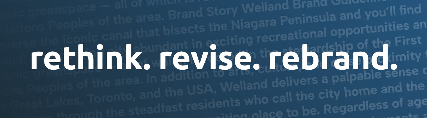
The public consultation was completed in the late spring, early summer of 2022 for the City of Welland's rebranding exercise. Since then, our creative partner in crime, Cinnamon Toast, has taken all the feedback, data, and information underground to develop, revise, reimagine, and rethink just what could appear in the final proposal.
That proposal goes to Welland City Council on March 21. Leading up to the report, we're sharing how we got there, what took place, what ideas were tossed around, and how the process is so much more than just a "new logo".
Special thank you to Bronwyn Mondoux and Beverly Hyatt of CT (and their entire team, don't get us wrong) for all their work on the project and for joining #WhatsUpWelland for sharing more about the work undertaken since the initial RFP was issued in January 2022. -
Fact vs. Fiction
Share Fact vs. Fiction on Facebook Share Fact vs. Fiction on Twitter Share Fact vs. Fiction on Linkedin Email Fact vs. Fiction link

Fiction: The rebrand will cost 1.2 Million dollars
Fact: The rebranding exercise, which included research, consultation, design, revisions, videography, photography, editing, template creation, and more, cost $65,000. These funds were approved in the 2022 capital budget. In 2023, City Council approved $50,000 in the capital budget for implementation. Existing assets, such as park signs, street signs, and printed materials, will be replaced once they reach the end of their useful life.Fiction: The City is ignoring arts and culture in the rebranding outcomes.
Fact: Thoguh arts and culture may not be listed as some of the headings in the branding document, the brand presentation documents are pulling from the public consultation and community feedback sections. Not every sentiment is captured in a headline, but arts and culture is not being ignored or forgotten.Fiction: This is the third time consultants have created brand concepts.
Fact: This is the first time the City of Welland has undergone a professional, comprehensive branding exercise that included public consultation, research, municipal auditing, and professional design.Fiction: The rebranding exercise has a $300,000 price tag.
Fact: The rebranding exercise, which included research, consultation, design, revisions, videography, photography, editing, template creation, and more, cost $65,000. These funds were approved in the 2022 capital budget. In 2023, City Council approved $50,000 in the capital budget for implementation. Existing assets, such as park signs, street signs, and printed materials, will be replaced once they reach the end of their useful life.Fiction: There was no community input for the rebrand.
Fact: In 2022, the City of Welland hosted a digital survey on its engagement platform, www.engagewelland.ca. The survey was open for several weeks and allowed for input from everyone. Additionally, one-on-one interviews and focus group sessions were conducted. All of the feedback received during this process was implemented into the proposed brand.Fiction: There hasn’t been any information about this rebrand until now.
Fact: The rebrand was first brought forward to Council in 2021 as part of the 2022 budget review committee process. Council approved the decision unit and provided direction for staff to conduct the rebranding exercise. The City of Welland created an Engage Welland page for information, updates, and hosting a digital survey and left the page open for questions during the year. Now that the exercise is complete, information about the findings is being shared leading up to the final report on March 21.Fiction: We just rebranded a few years ago.
Fact: The City of Welland did not rebrand a few years ago. In 2016, a community design contest was held to design a logo. A logo is not a brand. A brand is a framework that drives and streamlines how a corporation presents itself. The logo contest did not meet best practices, undergo the research and professional design required, and was widely panned by those in the graphic design industry. You would not rely on a community design contest for architectural designs, so why do it for a corporation’s identity?Fiction: A logo is a brand.
Fact: A brand is not a logo, product, or service. A brand is an emotional connection continuously created through experiences delivered and stories told. If you think of a brand as a book, the logo may be on the cover, but the brand is all the pages of the story that follow.
Who's Listening
-

Phone 905-735-1700 x2337 Email marc.macdonald@welland.ca -

Email rachel@cinnamontoast.ca
